Problem:
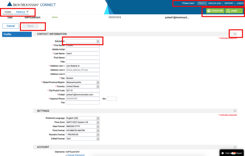
As a company wide initiative to support disabled employees, the focus has shifted to accessibility compliance of our websites and applications. My manager wanted to ensure that our applications are accessible for a majority of disabled users. We worked with accessibility vendors (Level Access and Deque) to review Iron Mountain ConnectTM, one of our core applications that most of our customers use. We analyzed the accessibility issues presented by the vendor.
We initially worked with Level Access and then moved to Deque as our accessibility vendor. We contracted them to analyze 11 main screens.
Team:
Five team members including developers and QA. I worked both as a UX strategist and contact between vendors and dev team and to work on design related accessibility.

Analysis:
The vendors presented the issues based on the severity and category page by page. We had to understand the issues by working with the vendor through several trainings on Accessibility issues and ways to mitigate them. We were at about 57 percent compliance. We wanted to focus on critical and issues that are easy to fix such as color contrast and keyboard focus on elements.
Top issues:
Name, role, value
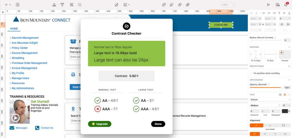
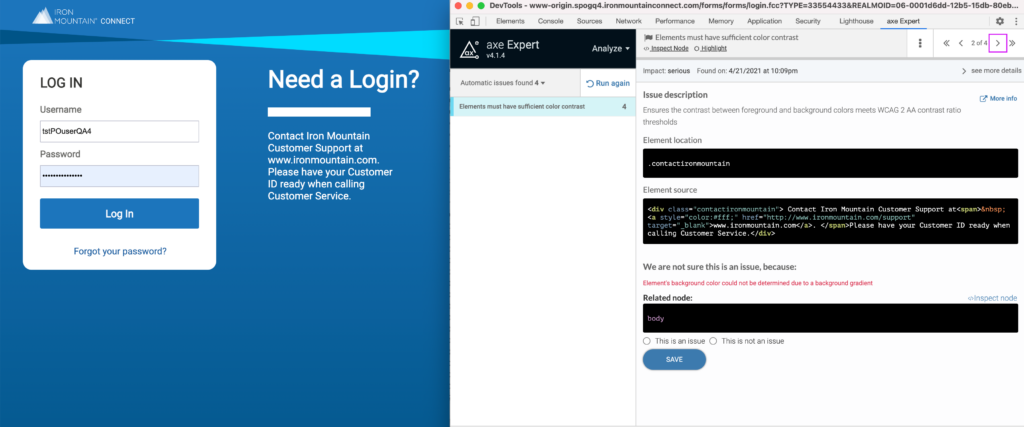
Color Contrast
Custom Controls
We worked with product management and added the issues to JIRA based on the severity focussing on critical issues first. Worked tackled them in different releases. We had to understand the issues at a code level to understand the possible solutions suggested by the vendor. I also reviewed WCAG2.1 guidelines to understand the criteria and suggestions to comply.
Process and Tools:
I created an easy checklist for the dev team to fix the issues and then test it using axe dev tool and NVDA screen reader. I also worked on contrast issues by updating the visual guide to comply with WCAG 2.1 contrast ratios. I used Stark plugin in Sketch and chrome extensions for support.
We also learnt from the vendors that the automated accessibility testing tools can only find about 80% issues since some of them are subject to the context. An example would be alt text for images where we have to decide which images are decorative and which one are informational.
User Testing:
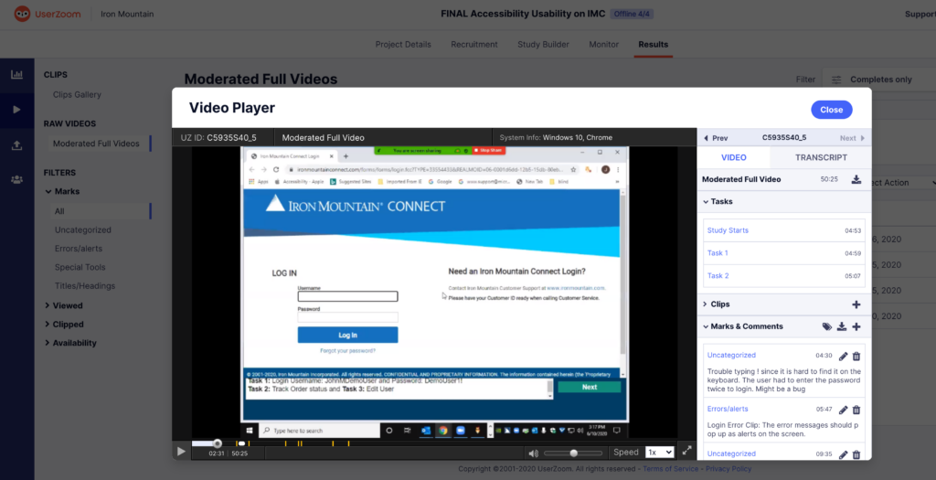
After we fixed some of the issues on some of the pages. We tested those pages with visually impaired users to understand their context as well as validate the improvements made. We were able to understand both the tools and few tricks that impaired users use to navigate a page. We received few suggestions to improve the accessibility. We captured them in JIRA backlog to be fixed in upcoming releases.
Learnings and Hurdles:
Our team had limited knowledge on Accessibility when we first started the project but it has been really good learning opportunity but often times the legacy code base had been an issue and often times resulted in manual work to fix the issues.
Our new applications are now being developed with accessibility as one of the criteria. We are creating accessibility specs as part of the design deliverables along with the wireframe. Working with developers to incorporate those specs when the design is implemented. We also created a process to ensure we incorporate accessibility specs directly in the component library and in the features being developed.
I can talk more about my processes and checklists I created in person.


