About Iron Mountain:
Iron Mountain provides information storage and management services to enterprises and SMBs across 50+ countries.
Problem:
Iron Mountain has acquired the second largest competitor and it has it’s own set of services and customers across different markets. These are some of the high level problems observed and need to be tackled.
- Constant Integration of new applications onto Iron Mountain Connect
- Many redundant services and customer facing systems
- Disjointed experience across different systems
Team:
UX Manager, UX Lead/Interaction Designer(Me), UX researcher, Visual Designer
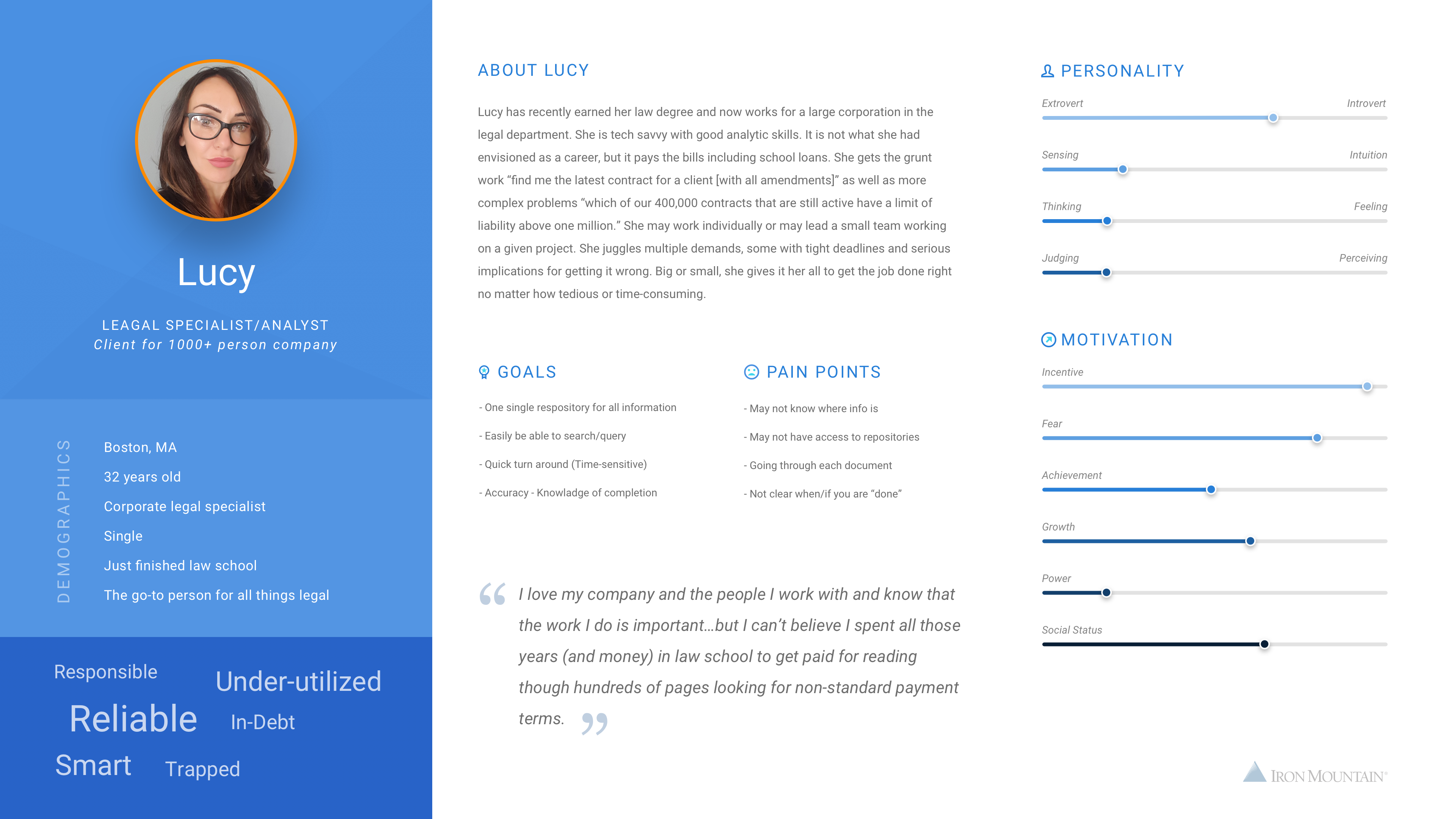
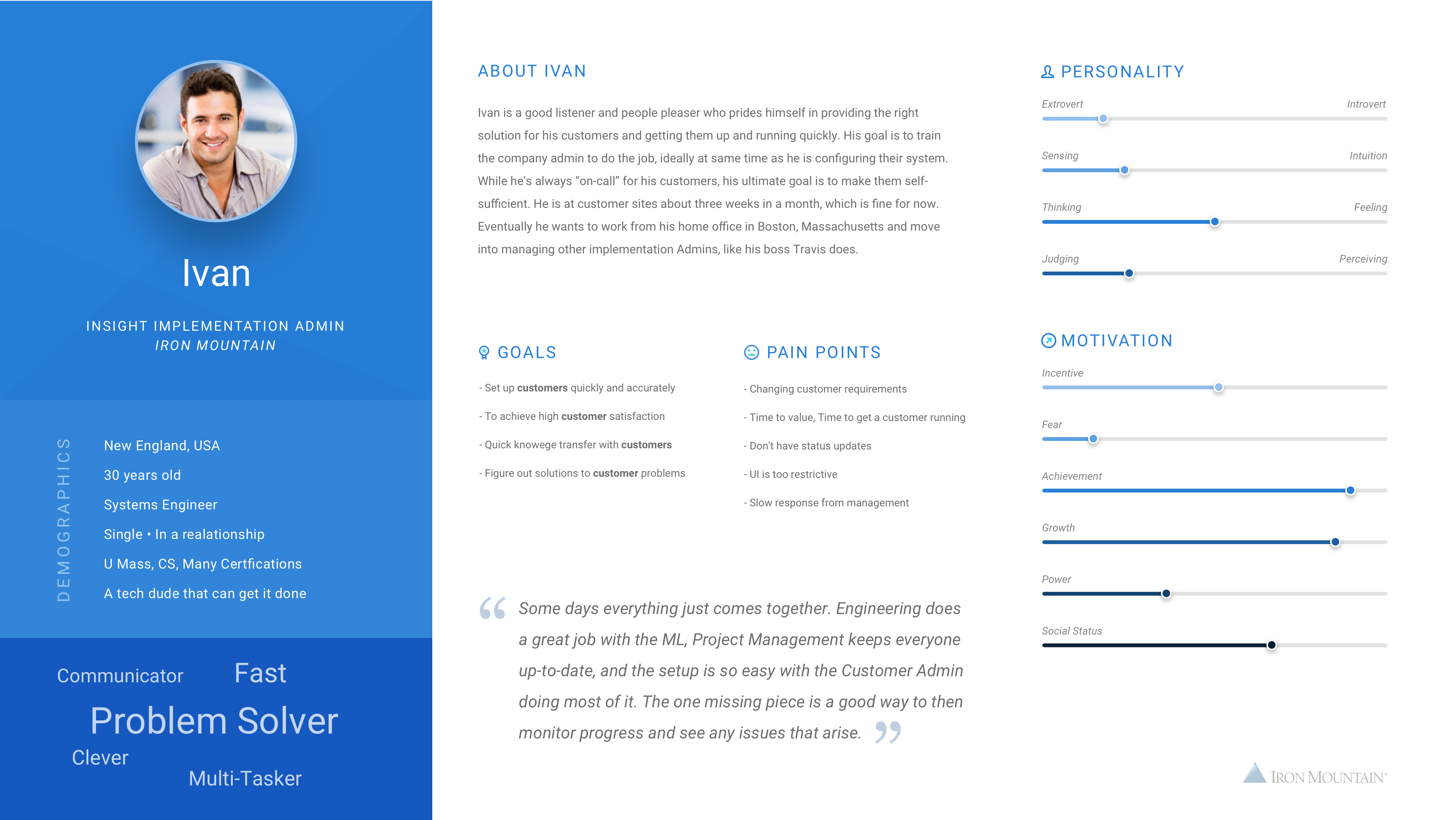
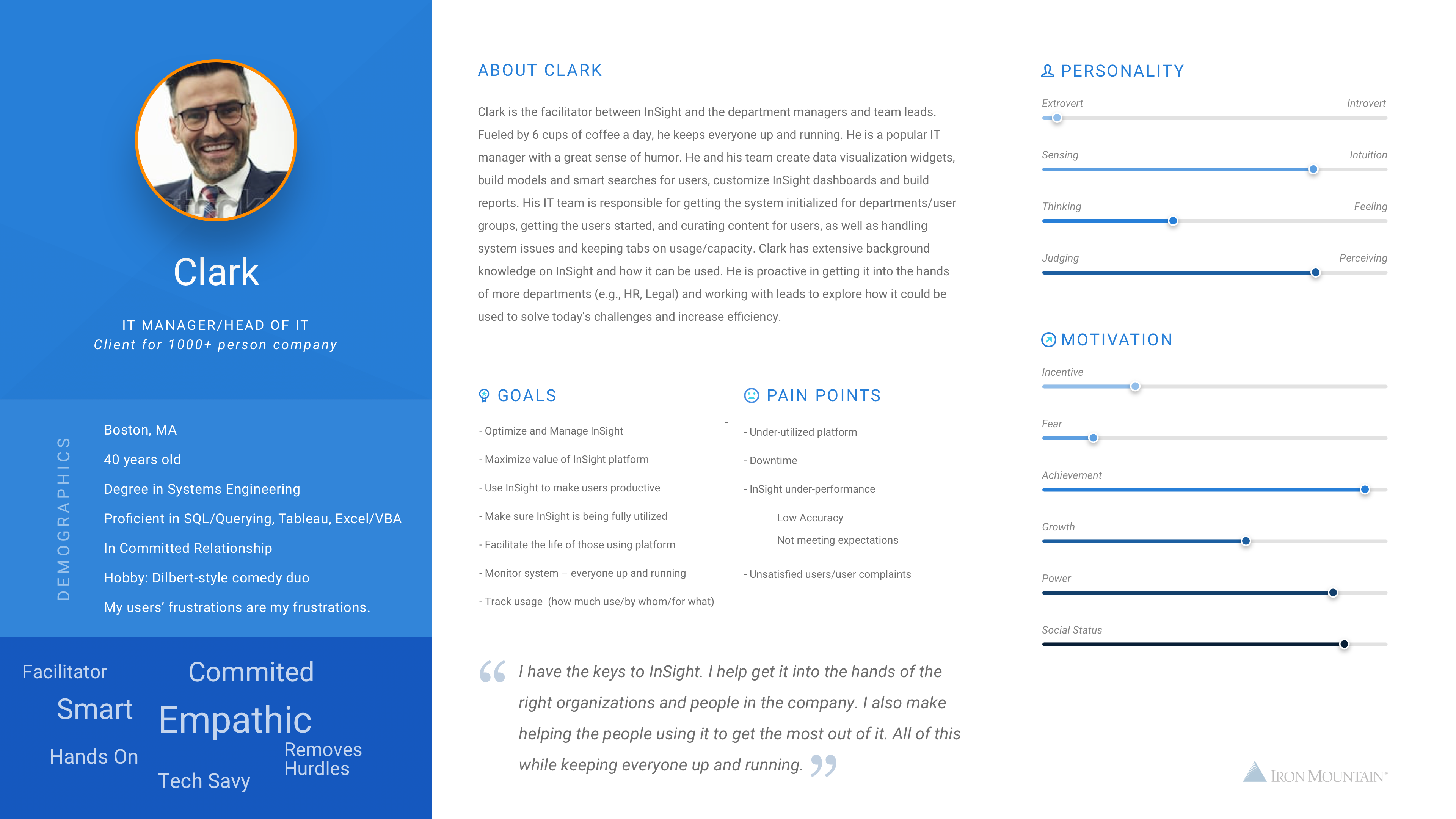
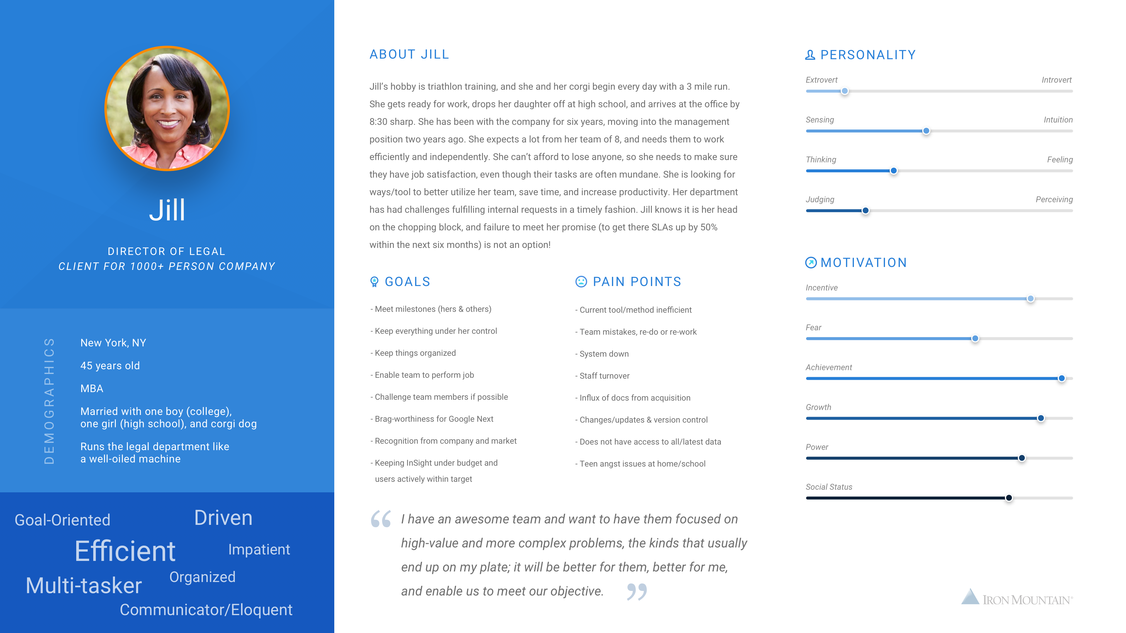
User Research:
Research team has conducted onsite and virtual user interviews with customers across USA and Brazil to understand the customer personas, work environment, pain points and current processes they use in their locations.
Users: 15 users across 5 different clients. Records managers, IT admins Department specific (HR, Legal) users of Iron Mountain related applications
Common Research Findings
- Many applications doing things differently
- Process requests are slow and often manual on some applications
- Search is slow to find the documents and cannot be searched by text
- Order tracking is complex and need multiple steps
- New user requests are different for each application
- Training is big effort and new users need internal training to use the system
- Security/Firewall issues when logging into to some applications
- Limited support file formats and file sizes
Design Thinking Session:
Pain Points to high level requirements
- Scalable
- Considerate
- Completely Self Serving
- Lighter and Faster
- Proactive and informative system
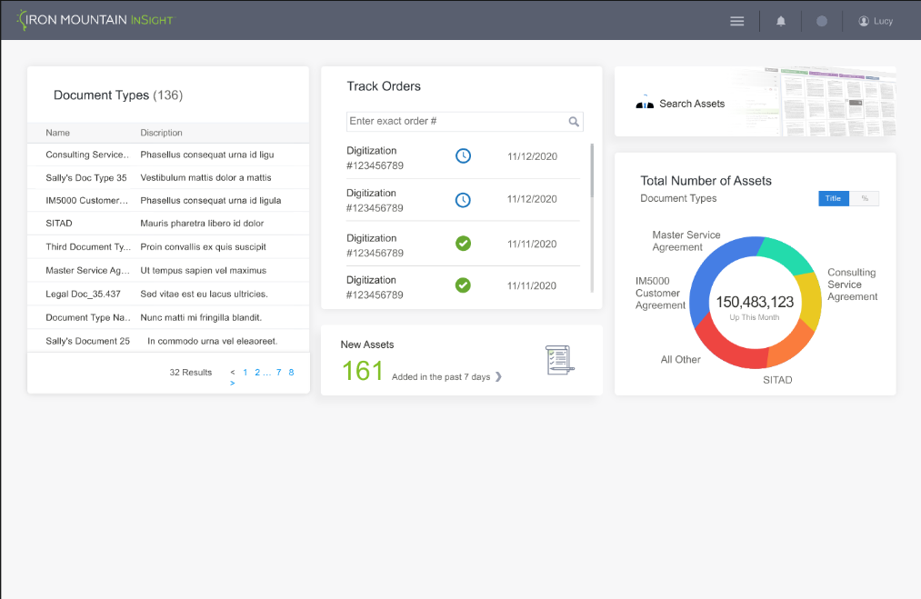
Features
- Single Sign on
- Quick Actions
- Instant Global Search
- Onboarding process
- Suggestions based on AI
- Proactive suggestions
- Dynamic dashboard
- Universal Access and Ordering systems
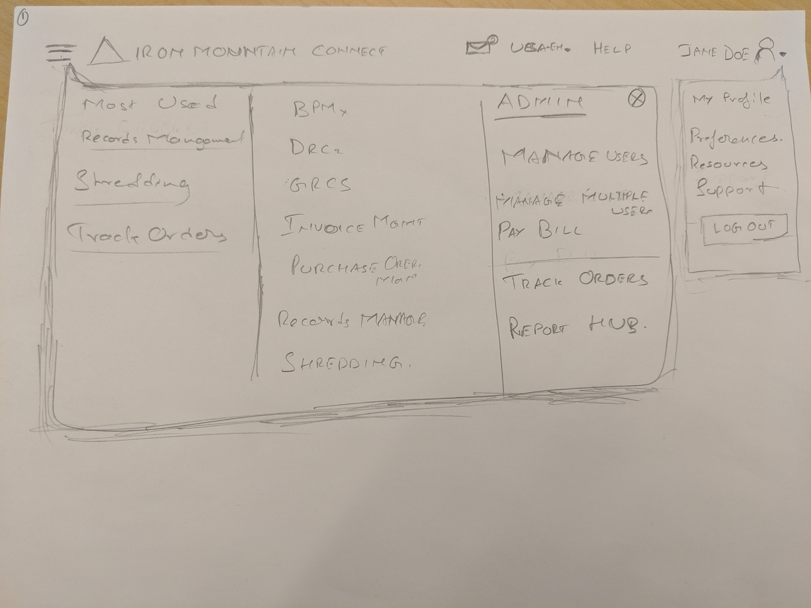
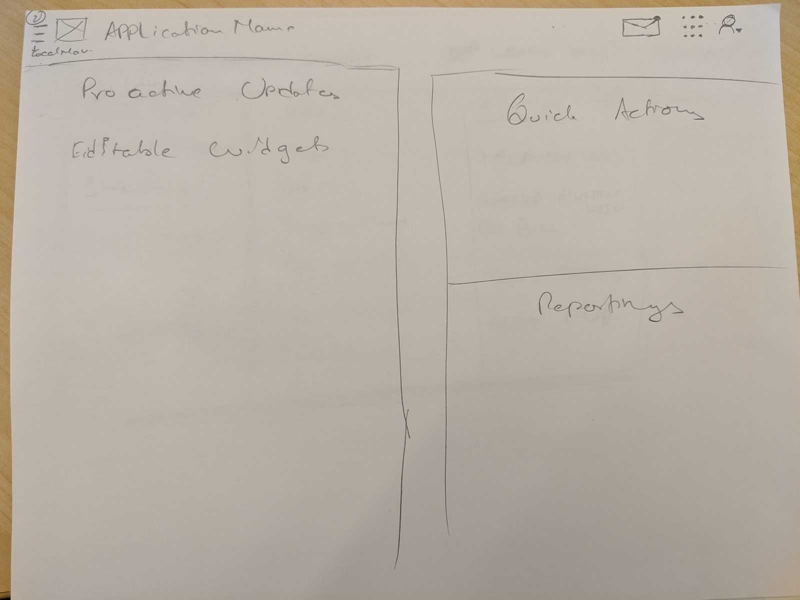
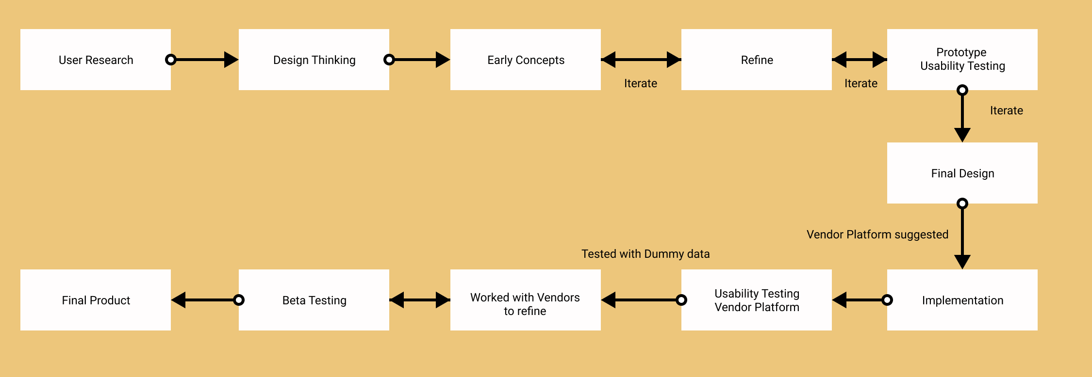
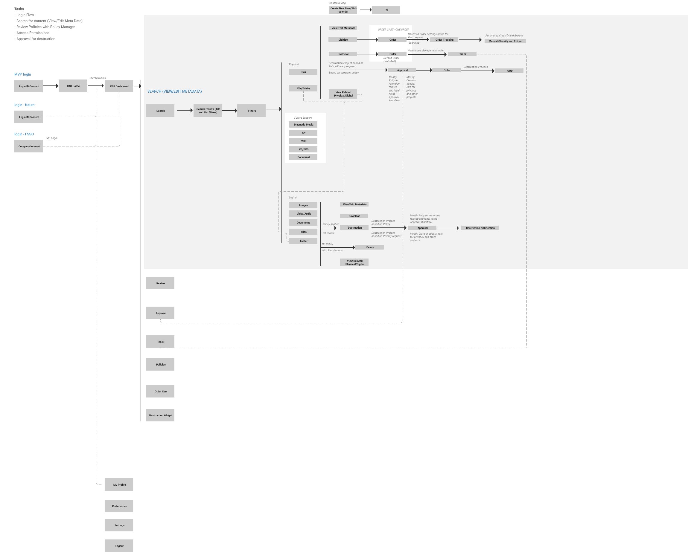
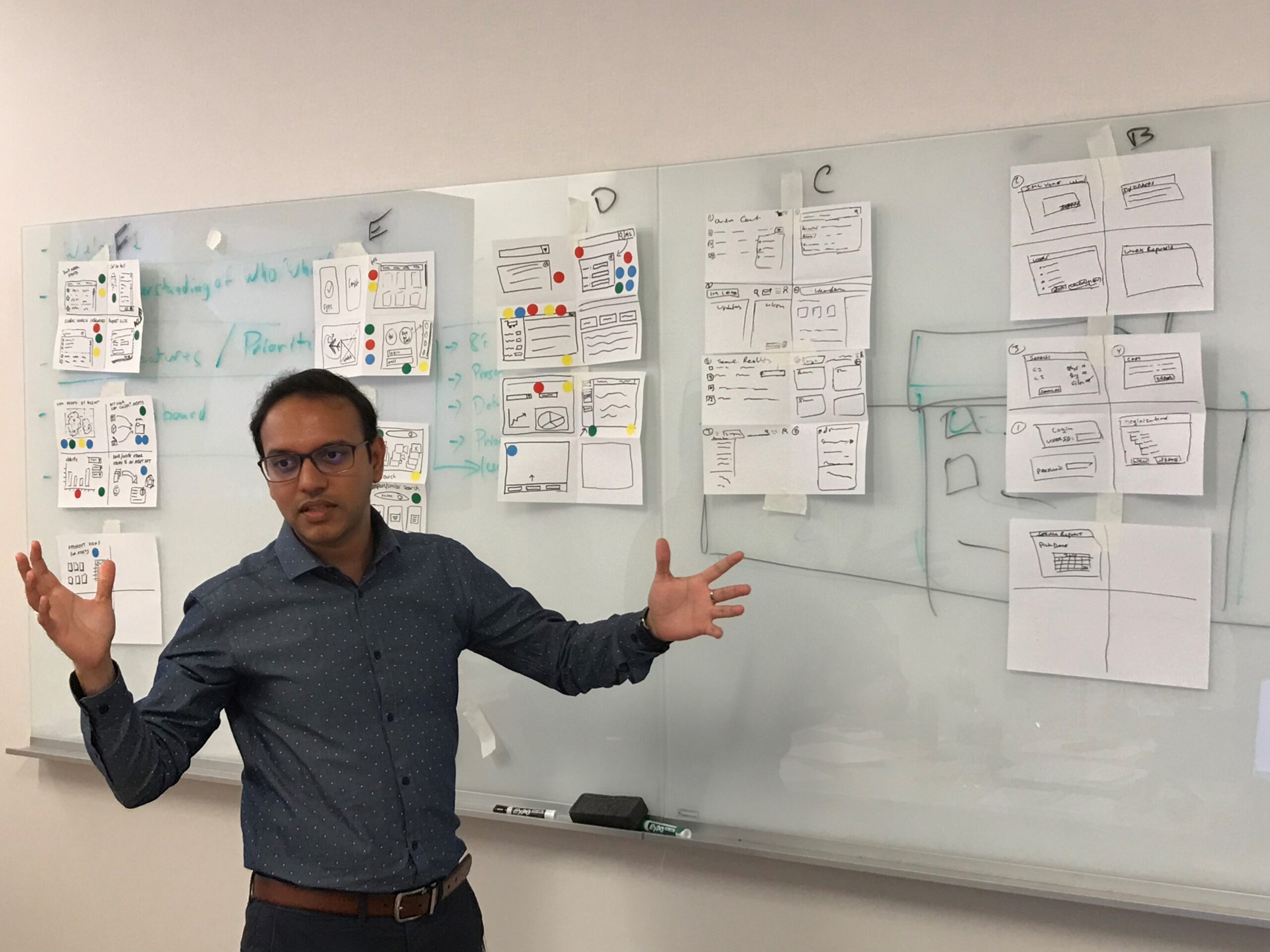
Early Concepts and Wireframes:
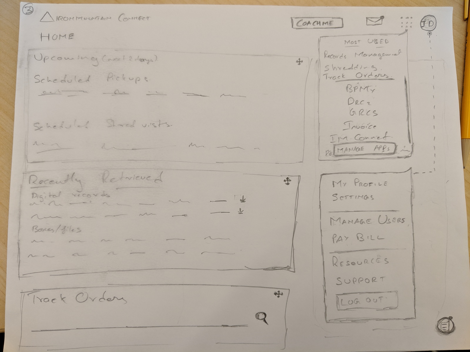
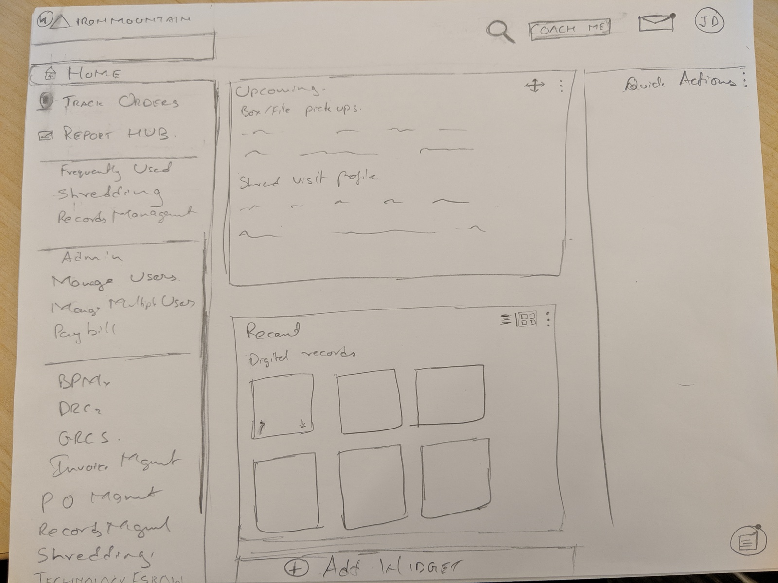
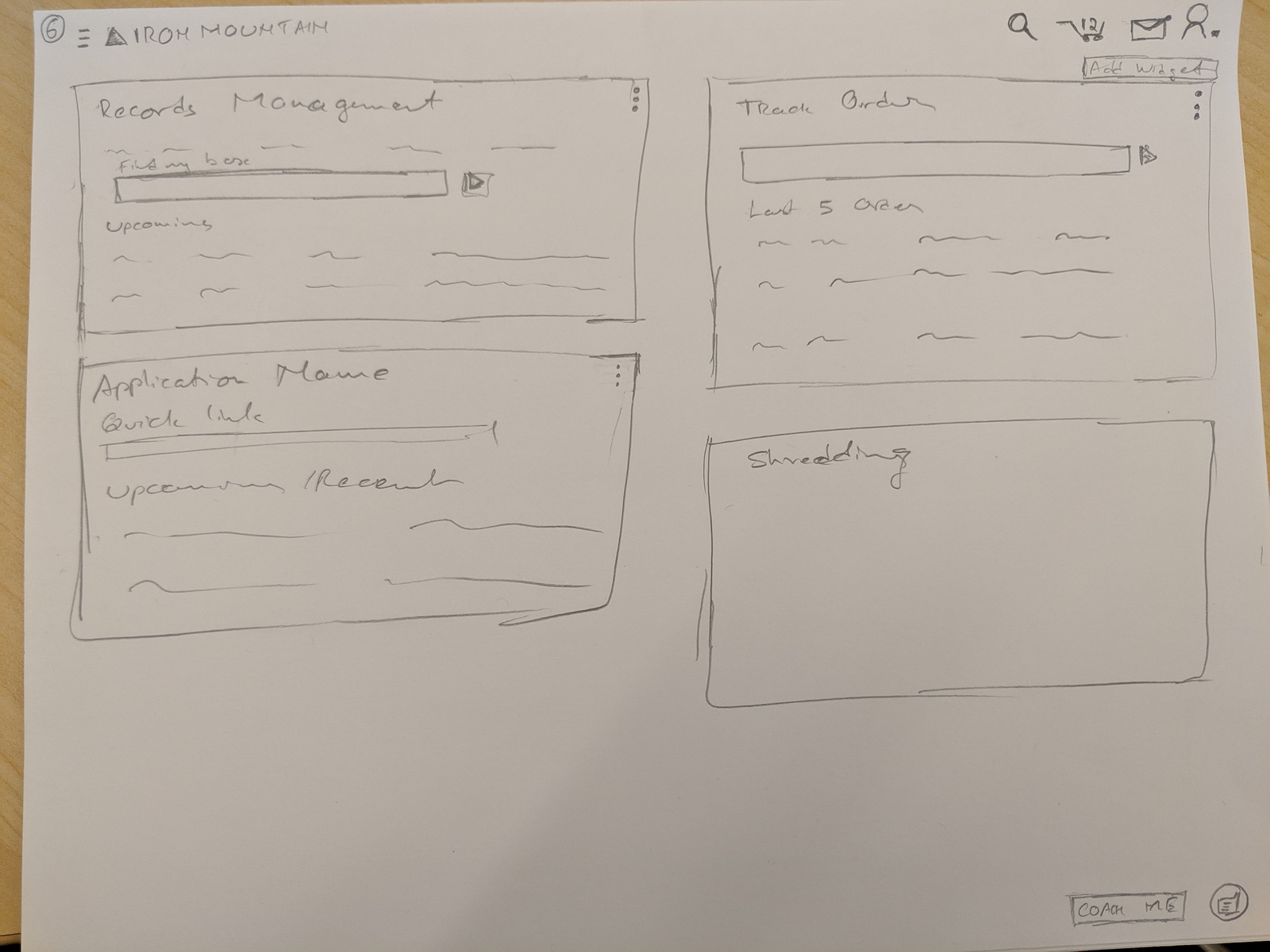
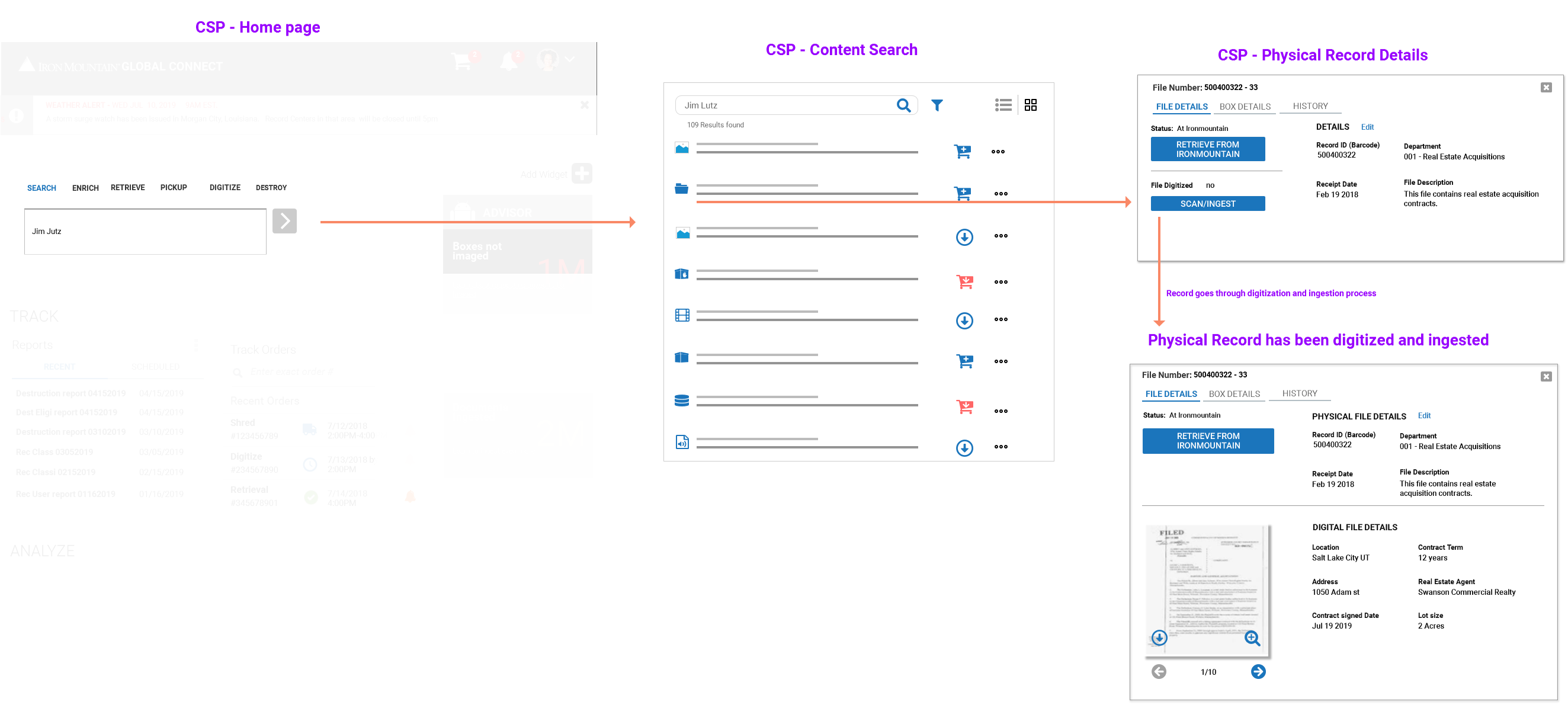
I tool the initial concepts and sketches and created wireframe variations. One of the primary ideas that came out of design thinking session is to make services as actions instead of going to different applications. This would make the system more scalable and help reduce multiple logins and provide a single platform for all user needs.
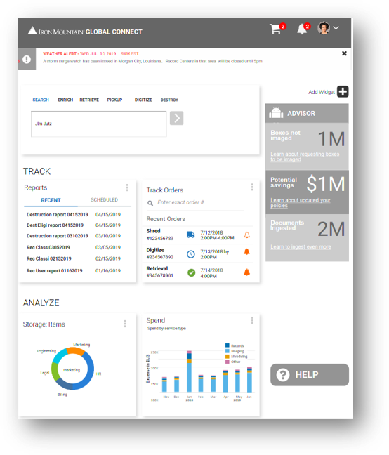
We took the dashboard designs from an existing product that was recently built. I focused my work more on the search and filters part of the design. I iterated on the wireframes through design reviews with UX peers and product management.
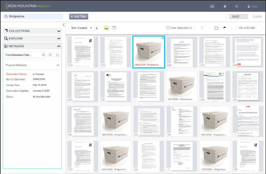
Problems:
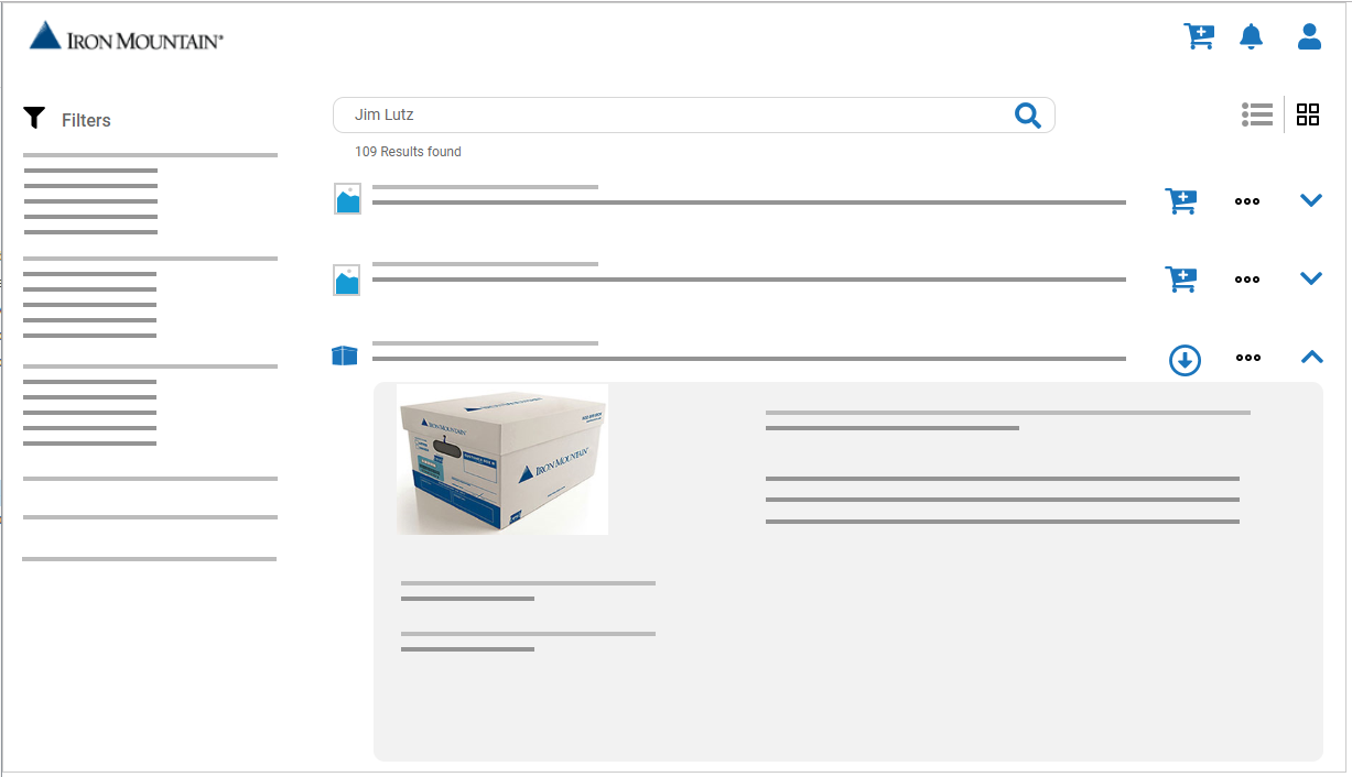
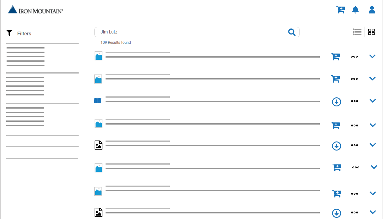
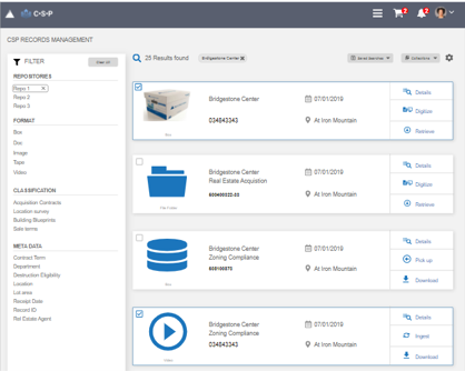
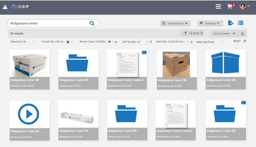
Some of the main problem areas around search and filters are the presenting both physical and digital information from different backend systems. Each of those assets might be of different formats and have different metadata associated. We have to show that information clearly and easily while presenting any relation between those assets.
Filters are complex since we are dealing with enterprises which might have thousands of assets in various locations and custom metadata. Having multiple filters that needs to accommodate a vast set data types can make it overwhelming.
User Testing and Final iteration:
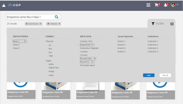
I tested the initial wireframes with internal users to get feedback on the filter variations and search results. Observed that filtering process is indeed overwhelming and that users don’t need the filters every time they use search especially if they save the search or search for specific set of documents (collections).
- I created filter designs which are dynamic to ensure the filtering systems is guided and gives the users a sense of direction to fine tune the results only when needed.
- I created patterns to save the searches and also create folder to store the documents in a container which they can use later.
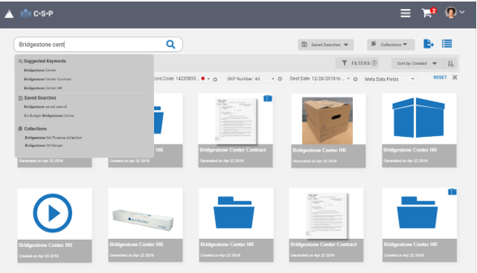
- Also created designs to show suggested keywords and recent searches in the search field.
Implementation:
Senior executive team wanted to make use of an external vendor platform instead of inhouse development since it would require a lot development resources and time.
- Vendor platform was designed for users in entertainment industry which had a lot of focus on media content (photos, images, audio, video)
- The platform has a lot of functionality which can be overwhelming for a regular user
We worked with the vendor team to implement expert and novice user setting to reduce the complexity on the search results page, and changed the labels to reflect our customers. I worked with visual designers to fine tune the interface to make it consistent with the brand guidelines.
Further improvements and next steps
- Improve the UI (Visual complexity)
- Ingest the content to provide proactive suggestions
- Product engineering team is currently exploring another low code content services platform