Newegg.com
I have redesigned the information architecture of the website www.newegg.com to ensure the user can navigate to the desired product easily while minimizing the ambiguity. It is a part of course work we worked on
Process flow:
Expert review of the website –> Card sorting of categories in navigation –> Creating new site map –> Wireframes
Tools used: Optimal sort, Blasamiq
Problem:
The current navigation of the website has product in multiple categories, different sister sites and categories they might not be related which increases the time spent in finding any particular shopping item. Hence reducing the number of items bought as well as the ease of use.
Solution:
Understanding the current structure of the website, the end users of the site, business model to categorize the product lines and present relevant information which helps the end users find the most appropriate item quickly.
Expert review:
I conducted an expert review of the website to understand the issues relevant to navigation and structure while getting some hands on with the website. I couldn’t talk to the business team from newegg.com but I would have done that to understand the business model if I had a chance.
Newegg.com: Expert review
Card sorting:
I had to get information about structuring of the categories, so I conducted card sorting with some of the users who are regular to online shopping especially electronics. I took the existing categories from the site and used ‘Optimal sort‘ to perform card sorting. Most of the product lines where sorted as expected apart from a few outliers.
Site Map and Wireframes:
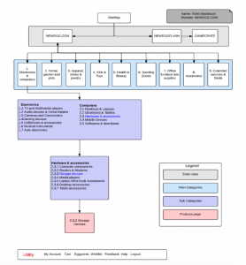
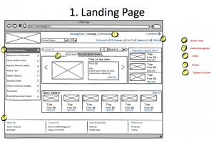
I used the results from card sorting as well as reviewing other online shopping websites like Amazon, Walmart and Staples to understand their structure and categorization. I used this information to create a new sitemap for Newegg.com. Based on the new structure, I created wireframes which shows the navigation towards a single product from the home screen.
Site Map
Wireframe
Redesigned Newegg.com: Sitemap and Wireframes


