Lowe’s In-House Chat UI Design System
Designing an in-house chat system that brings consistency, scalability, and human-centered UX to conversational support at Lowe’s.
Iron Mountain Website Redesign
Redesigned Iron Mountain website across 50+ countries and multiple languages to improve visibility into their vast array of services across information lifecycle management across different regions of the world.
Company
IronMountain
Role
UX Design Manager
Duration
2 years
About The Project
Iron Mountain provides information storage and management services and solutions. The company operates in 50+ countries. Iron Mountain acquired Recall (second largest competitor) in 2016. With the acquisition, we had to accommodate the new services across different countries. This called for an opportunity to understand the users and present the information on our websites according to their mental models. This led to the project to redesign the websites and launch across all the countries we operate in. I lead the redesign project in digital marketing team.
Problem
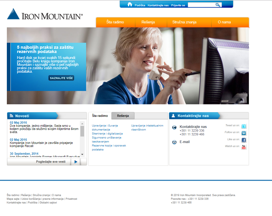
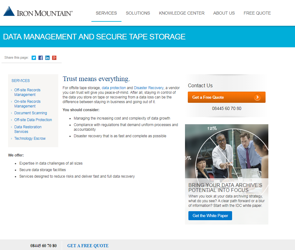
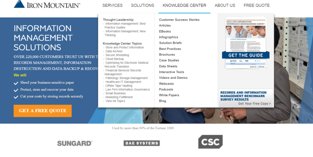
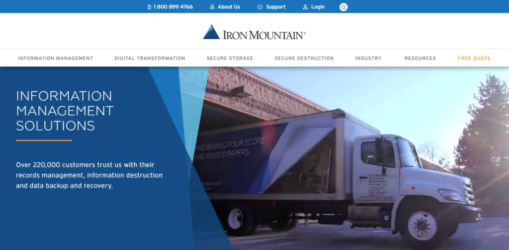
Old Iron Mountain website
Team
Digital Marketing Director, UX Manager, Interaction Designer, Web Developer
My Contributions
UX Strategy, user research, wire framing, research and design demos, mentoring UX peers, collaboration with product marketing, branding, and web development
Tools used
Axure, Google Analytics, Hot Jar, Invision, Optimal Workshop
Process
For the project, I had a UX designer and myself in my team to support the project. I spoke to product marketing teams, web development and sales team to understand the business and technology first. Then we conducted a heuristic evaluation to understand the problems on the website. I created a plan to conduct the user research, design and user testing and handoff for development.
User Research
After reviewing the website, we conducted a card sorting exercise with customers and external users similar to our target users. We wanted to categorize the services and solutions according to the mental models of the target users. In this case, the users are buyers of Iron Mountain services.
Then we conducted user interviews to understand the buying process of our users to ensure the content presented on website helps with their process.
User PersonasWe recruited our users based on the following personas defined
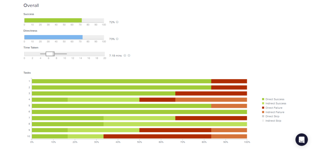
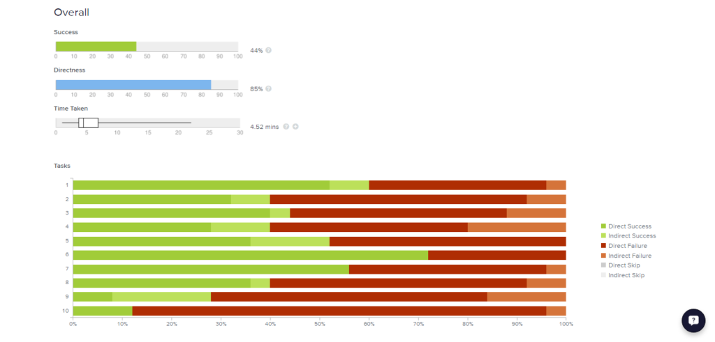
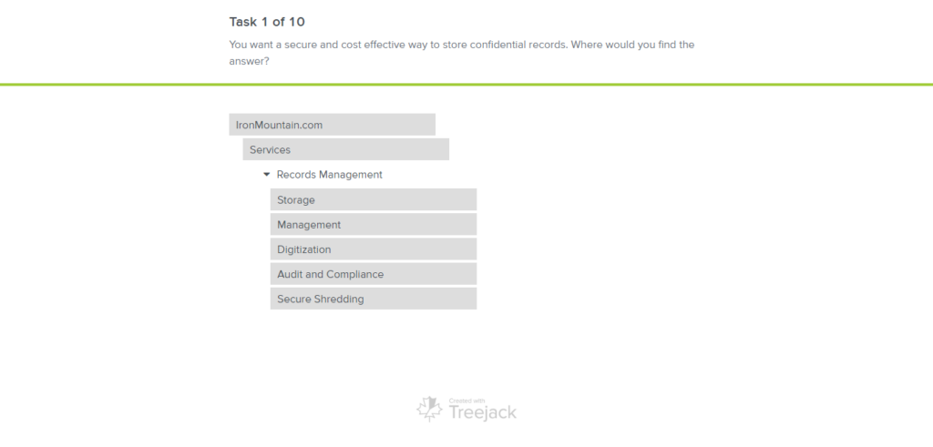
Card sorting and Tree testing analysis
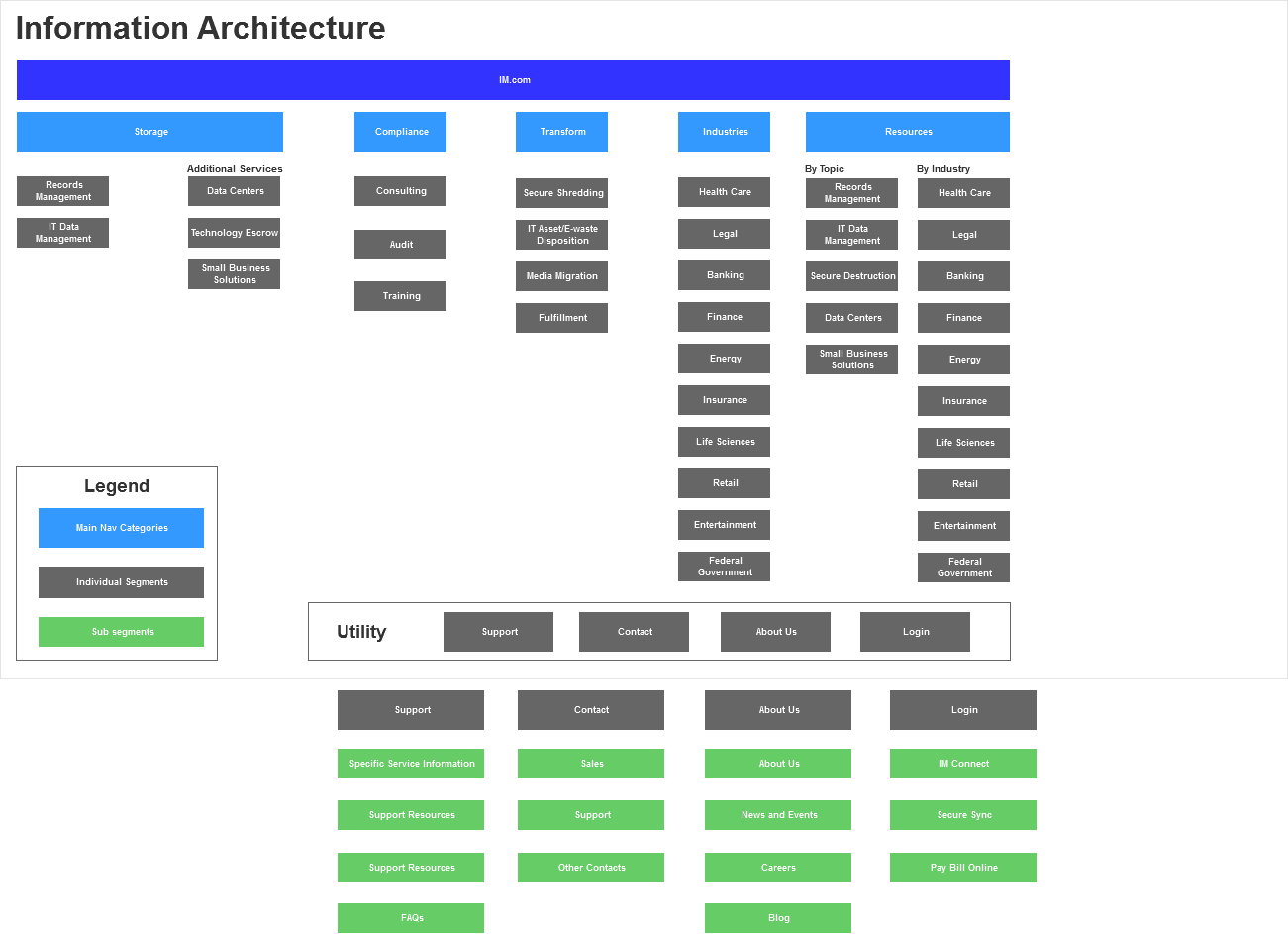
User Journey Map and Information Architecture
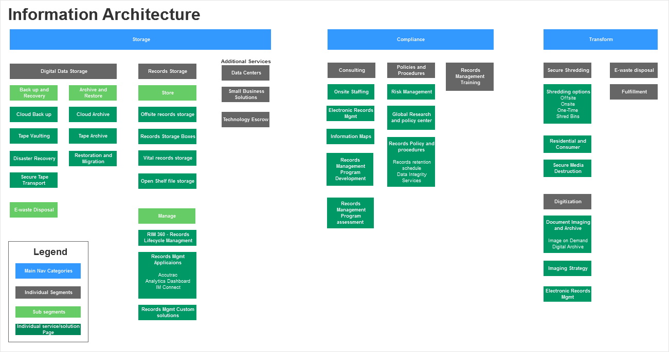
Created buyer journey map and draft information architectures (IAs) based on the analysis of the user interviews and card sorting exercises. We also used data from Google Analytics to understand analyze page visits, bounce and exit rates. Tested the IAs using the tree testing with the users.Presented the findings and suggested IAs to broader teams for feedback. There were pushbacks from some business segments but resolved those and finalized the IA. We created broad categories/service pillars based on the findings.
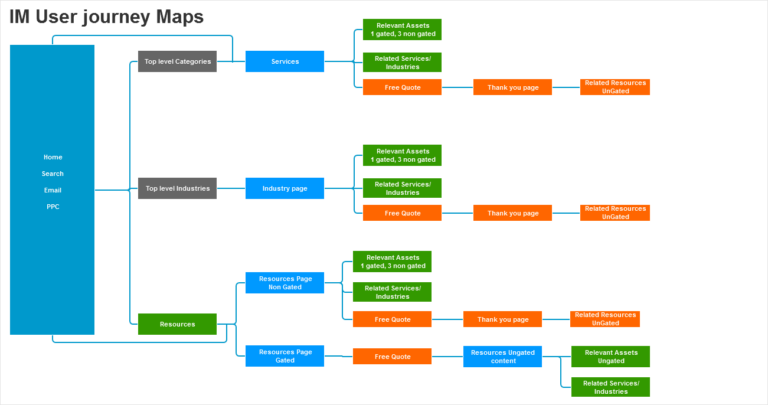
User workflows on website
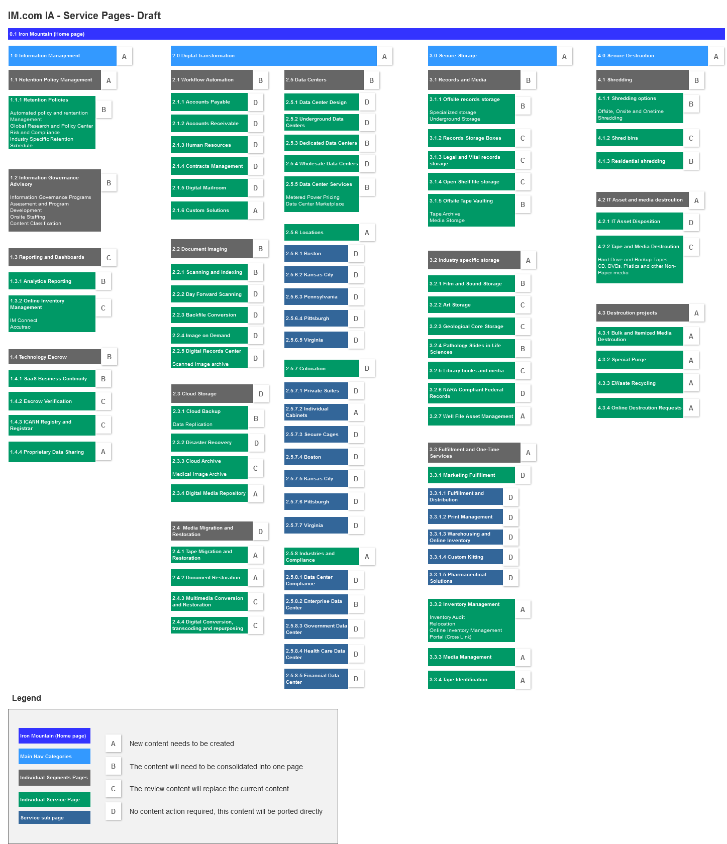
Multiple information architecture structures were created based in user research analysis

Finalized information architecture
Design
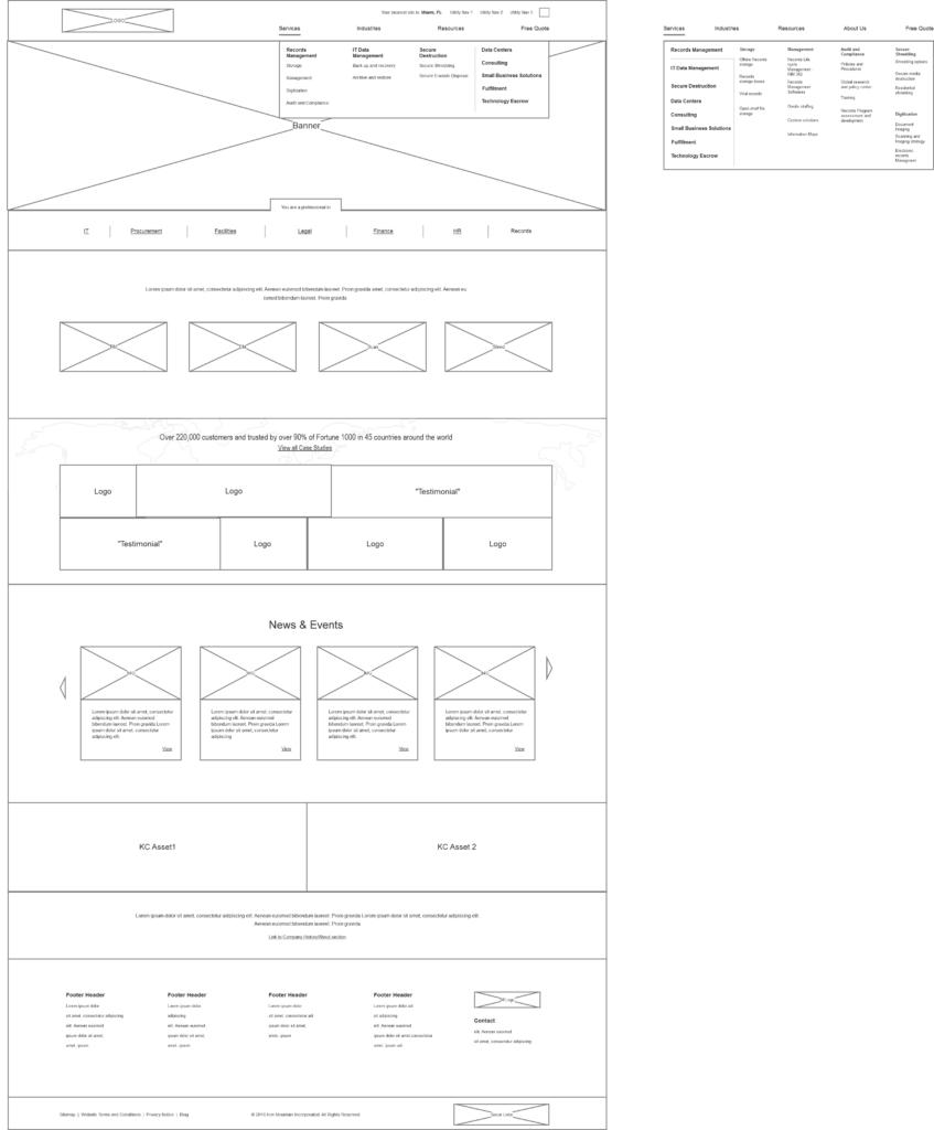
We then created variations of navigation based on the IA and tree testing. Our goal was to ensure a user could access any content on the website with two to three clicks. We achieved it by balancing the breadth and depth of the content. We designed sticky navbar to help the user navigate across the segments easily from anywhere on the page.
Based on interviews and buyers journey, we created on-page user journey templates based on the “Why, what, how” structure of content. We iterated on the designs of both navigation and templates based on results from user testing and internal feedback.
Early Wireframes
Visual Design
We worked with the branding team to ensure the website’s visual design follows the branding guidelines. The fonts, colors, icons have been optimized for web use.
Content and SEO
Worked with the content writers to ensure content for the redesigned website follows page templates created. We worked with content team and created content governance plan to automatically mark and clear or refresh dated content. Based on the analytics we removed redundant content and reduced the number of pages by 60%.
All the metadata associated with the pages and resources is consolidated and updated to improve the visibility and content search.
We also worked with SEO to ensure the new content has the keywords and backlinks to ensure the visibility of the pages. We also updated the page links with short and readable text for URLs.
Finalized Design
Implementation
We worked with an external vendor to build the websites on Sitecore. They created page components based on the designs, which can be easily used by the web team to present the content based on the templates.
We updated content search to provide instant search results in resources section and also improved site wide search with search suggestions.
Global Design
We worked with local marketing teams from different countries to understand their service offerings and local buyers. We worked with them to create Information Architecture and content local to their market and still maintained consistency with the global service pillars.
Worked with central content team to create the content and had them reviewed and translated in locally to ensure the content caters to the needs of local users.
Launch and Post Launch Design Updates
After the launch, we observed and analyzed the data about page visits, bounce and exit rate and heat maps. We made changes to the placement of the logo which took too much space. We also reduced the size of the hero banners for page template so that body of content is read easily.
Questions?
Reach out to me if you have any questions or want to learn more about the process, learnings and hurdles along the way.
Contact me
More Case Studies
Designing an in-house chat system that brings consistency, scalability, and human-centered UX to conversational support at Lowe’s.

Designed AI-powered global portal for Iron Mountain, unifying data storage, search, and management across acquired services for seamless enterprise user experience.
Iron Mountain Website Redesign
Redesigned Iron Mountain website across 50+ countries and multiple languages to improve visibility into their vast array of services across information lifecycle management across different regions of the world.
Company
IronMountain
Role
UX Design Manager
Duration
2 years
About The Project
Iron Mountain provides information storage and management services and solutions. The company operates in 50+ countries. Iron Mountain acquired Recall (second largest competitor) in 2016. With the acquisition, we had to accommodate the new services across different countries. This called for an opportunity to understand the users and present the information on our websites according to their mental models. This led to the project to redesign the websites and launch across all the countries we operate in. I lead the redesign project in digital marketing team.
Problem
Old Iron Mountain website
Team
Digital Marketing Director, UX Manager, Interaction Designer, Web Developer
My Contributions
UX Strategy, user research, wire framing, research and design demos, mentoring UX peers, collaboration with product marketing, branding, and web development
Tools used
Axure, Google Analytics, Hot Jar, Invision, Optimal Workshop
Process
For the project, I had a UX designer and myself in my team to support the project. I spoke to product marketing teams, web development and sales team to understand the business and technology first. Then we conducted a heuristic evaluation to understand the problems on the website. I created a plan to conduct the user research, design and user testing and handoff for development.
User Research
After reviewing the website, we conducted a card sorting exercise with customers and external users similar to our target users. We wanted to categorize the services and solutions according to the mental models of the target users. In this case, the users are buyers of Iron Mountain services.
Then we conducted user interviews to understand the buying process of our users to ensure the content presented on website helps with their process.
User PersonasWe recruited our users based on the following personas defined
Card sorting and Tree testing analysis
User Journey Map and Information Architecture
Created buyer journey map and draft information architectures (IAs) based on the analysis of the user interviews and card sorting exercises. We also used data from Google Analytics to understand analyze page visits, bounce and exit rates. Tested the IAs using the tree testing with the users.Presented the findings and suggested IAs to broader teams for feedback. There were pushbacks from some business segments but resolved those and finalized the IA. We created broad categories/service pillars based on the findings.
User workflows on website
Multiple information architecture structures were created based in user research analysis
Finalized information architecture
Design
We then created variations of navigation based on the IA and tree testing. Our goal was to ensure a user could access any content on the website with two to three clicks. We achieved it by balancing the breadth and depth of the content. We designed sticky navbar to help the user navigate across the segments easily from anywhere on the page.
Based on interviews and buyers journey, we created on-page user journey templates based on the “Why, what, how” structure of content. We iterated on the designs of both navigation and templates based on results from user testing and internal feedback.
Early Wireframes
Visual Design
We worked with the branding team to ensure the website’s visual design follows the branding guidelines. The fonts, colors, icons have been optimized for web use.
Content and SEO
Worked with the content writers to ensure content for the redesigned website follows page templates created. We worked with content team and created content governance plan to automatically mark and clear or refresh dated content. Based on the analytics we removed redundant content and reduced the number of pages by 60%.
All the metadata associated with the pages and resources is consolidated and updated to improve the visibility and content search.
We also worked with SEO to ensure the new content has the keywords and backlinks to ensure the visibility of the pages. We also updated the page links with short and readable text for URLs.
Finalized Design
Implementation
We worked with an external vendor to build the websites on Sitecore. They created page components based on the designs, which can be easily used by the web team to present the content based on the templates.
We updated content search to provide instant search results in resources section and also improved site wide search with search suggestions.
Global Design
We worked with local marketing teams from different countries to understand their service offerings and local buyers. We worked with them to create Information Architecture and content local to their market and still maintained consistency with the global service pillars.
Worked with central content team to create the content and had them reviewed and translated in locally to ensure the content caters to the needs of local users.
Launch and Post Launch Design Updates
After the launch, we observed and analyzed the data about page visits, bounce and exit rate and heat maps. We made changes to the placement of the logo which took too much space. We also reduced the size of the hero banners for page template so that body of content is read easily.
Questions?
Reach out to me if you have any questions or want to learn more about the process, learnings and hurdles along the way.
Contact me
More Case Studies
Designing an in-house chat system that brings consistency, scalability, and human-centered UX to conversational support at Lowe’s.
Designed AI-powered global portal for Iron Mountain, unifying data storage, search, and management across acquired services for seamless enterprise user experience.
Iron Mountain Website Redesign
Redesigned Iron Mountain website across 50+ countries and multiple languages to improve visibility into their vast array of services across information lifecycle management across different regions of the world.
Company
IronMountain
Role
UX Design Manager
Duration
2 years
About The Project
Iron Mountain provides information storage and management services and solutions. The company operates in 50+ countries. Iron Mountain acquired Recall (second largest competitor) in 2016. With the acquisition, we had to accommodate the new services across different countries. This called for an opportunity to understand the users and present the information on our websites according to their mental models. This led to the project to redesign the websites and launch across all the countries we operate in. I lead the redesign project in digital marketing team.
Problem
Old Iron Mountain website
Team
Digital Marketing Director, UX Manager, Interaction Designer, Web Developer
My Contributions
UX Strategy, user research, wire framing, research and design demos, mentoring UX peers, collaboration with product marketing, branding, and web development
Tools used
Axure, Google Analytics, Hot Jar, Invision, Optimal Workshop
Process
For the project, I had a UX designer and myself in my team to support the project. I spoke to product marketing teams, web development and sales team to understand the business and technology first. Then we conducted a heuristic evaluation to understand the problems on the website. I created a plan to conduct the user research, design and user testing and handoff for development.
User Research
After reviewing the website, we conducted a card sorting exercise with customers and external users similar to our target users. We wanted to categorize the services and solutions according to the mental models of the target users. In this case, the users are buyers of Iron Mountain services.
Then we conducted user interviews to understand the buying process of our users to ensure the content presented on website helps with their process.
User PersonasWe recruited our users based on the following personas defined
Card sorting and Tree testing analysis
User Journey Map and Information Architecture
Created buyer journey map and draft information architectures (IAs) based on the analysis of the user interviews and card sorting exercises. We also used data from Google Analytics to understand analyze page visits, bounce and exit rates. Tested the IAs using the tree testing with the users.Presented the findings and suggested IAs to broader teams for feedback. There were pushbacks from some business segments but resolved those and finalized the IA. We created broad categories/service pillars based on the findings.
User workflows on website
Multiple information architecture structures were created based in user research analysis
Finalized information architecture
Design
We then created variations of navigation based on the IA and tree testing. Our goal was to ensure a user could access any content on the website with two to three clicks. We achieved it by balancing the breadth and depth of the content. We designed sticky navbar to help the user navigate across the segments easily from anywhere on the page.
Based on interviews and buyers journey, we created on-page user journey templates based on the “Why, what, how” structure of content. We iterated on the designs of both navigation and templates based on results from user testing and internal feedback.
Early Wireframes
Visual Design
We worked with the branding team to ensure the website’s visual design follows the branding guidelines. The fonts, colors, icons have been optimized for web use.
Content and SEO
Worked with the content writers to ensure content for the redesigned website follows page templates created. We worked with content team and created content governance plan to automatically mark and clear or refresh dated content. Based on the analytics we removed redundant content and reduced the number of pages by 60%.
All the metadata associated with the pages and resources is consolidated and updated to improve the visibility and content search.
We also worked with SEO to ensure the new content has the keywords and backlinks to ensure the visibility of the pages. We also updated the page links with short and readable text for URLs.
Finalized Design
Implementation
We worked with an external vendor to build the websites on Sitecore. They created page components based on the designs, which can be easily used by the web team to present the content based on the templates.
We updated content search to provide instant search results in resources section and also improved site wide search with search suggestions.
Global Design
We worked with local marketing teams from different countries to understand their service offerings and local buyers. We worked with them to create Information Architecture and content local to their market and still maintained consistency with the global service pillars.
Worked with central content team to create the content and had them reviewed and translated in locally to ensure the content caters to the needs of local users.
Launch and Post Launch Design Updates
After the launch, we observed and analyzed the data about page visits, bounce and exit rate and heat maps. We made changes to the placement of the logo which took too much space. We also reduced the size of the hero banners for page template so that body of content is read easily.
Questions?
Reach out to me if you have any questions or want to learn more about the process, learnings and hurdles along the way.
Contact me